Designing the hour before sleep.
Most sleep products focus on sleep. Sona focuses on what happens before it — a concept exploring how a ceramic dock, scent compositions, an app, and a brand might help people transition out of the day and into rest.
Designing the hour before sleep.
Most sleep products focus on sleep. Sona focuses on what happens before it — a concept exploring how a ceramic dock, scent compositions, an app, and a brand might help people transition out of the day and into rest.
Most of my work is commercial and tightly constrained — products built to ship and sell against a cost and a calendar. I took on this speculative brief deliberately, to work the muscle that day-to-day product work rarely asks for: starting from a behaviour rather than a brief, and designing a whole ecosystem rather than a single object.
The brief set the territory — a sleep and mindfulness ritual for urban professionals who'd tried everything and distrusted brands that over-promise — and asked for a product, an app, and a campaign. I used it to answer a larger question: if I could define a category from scratch, what would I choose to build, and what would I refuse to?
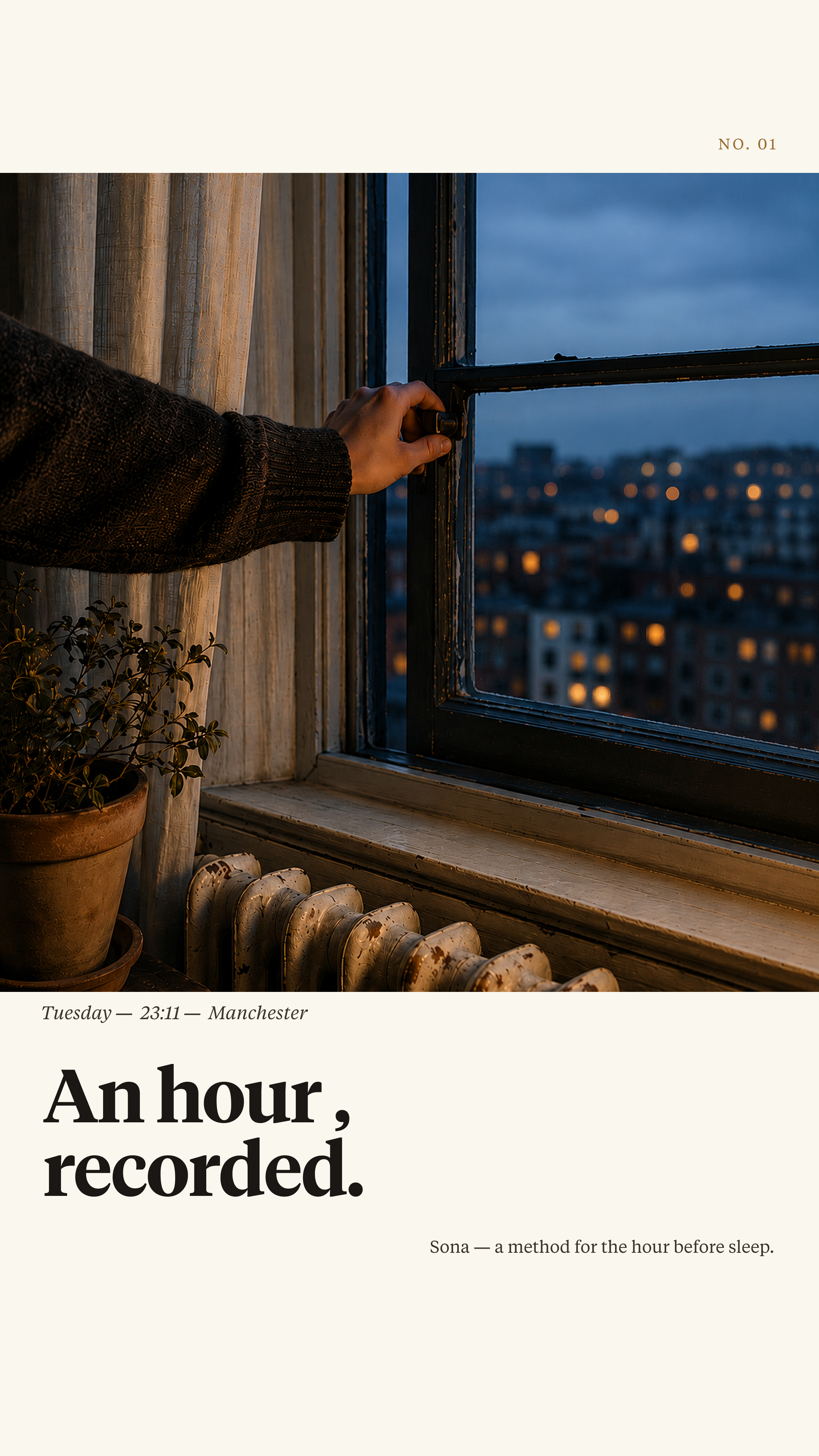
The sleep market is crowded, but it is almost entirely pointed at the wrong moment. Trackers, scores, and smart mattresses measure sleep once you're in it; supplements and teas treat the body. Almost nothing is designed for the hour before — the transition out of a stimulated day, which is where most people actually get stuck.
That gap is widening. Evenings have filled with screens engineered to hold attention, and the dominant “solution” — a sleep app on the same phone causing the problem — competes with the distraction instead of ending it. The underserved user isn't the person who can't sleep. It's the person who can't stop. That's an unowned category, and the bet behind Sona is that it's the one worth defining.
Before any form, I made three bets about how people actually relate to the end of the day — and pressure-tested each one: against my own reasoning, and in unstructured conversations with people I trusted to push back.
The first idea was a quiet record of restful nights. I dropped it before building it. The moment Sona scored your sleep, it would become the thing it was meant to replace — another metric to optimise, another reason to reach for the phone, another way to fail at rest.
So the founding decision was a refusal. In a category whose entire logic is measurement, choosing not to measure is the strategic bet — it's what makes Sona a different proposition rather than a softer-looking tracker. Everything else follows from that one line: the dock has no screen, the app has one job a night and then disappears, and the only thing Sona keeps is a plain record it draws no conclusions from.
The discipline wasn’t designing more. It was identifying what the category does by reflex — and deciding to do the opposite on purpose.
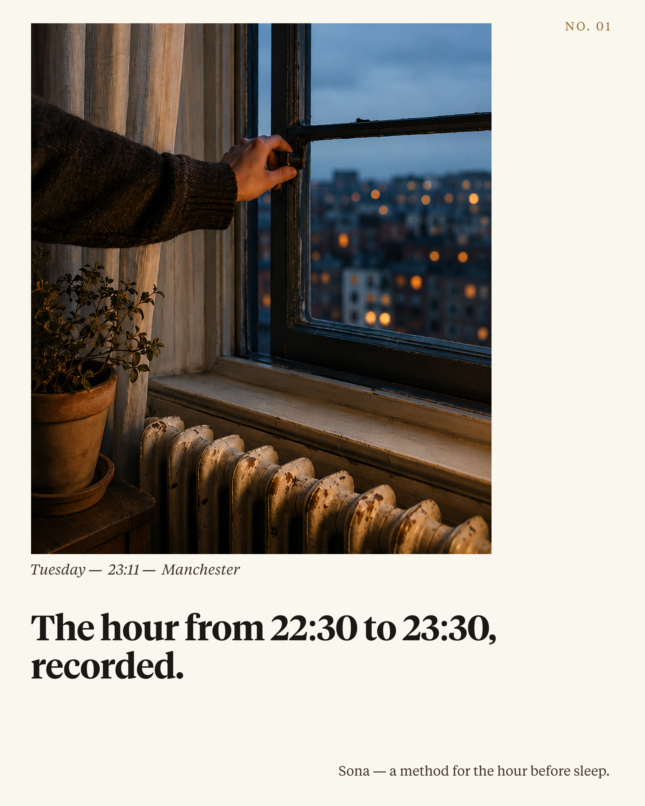
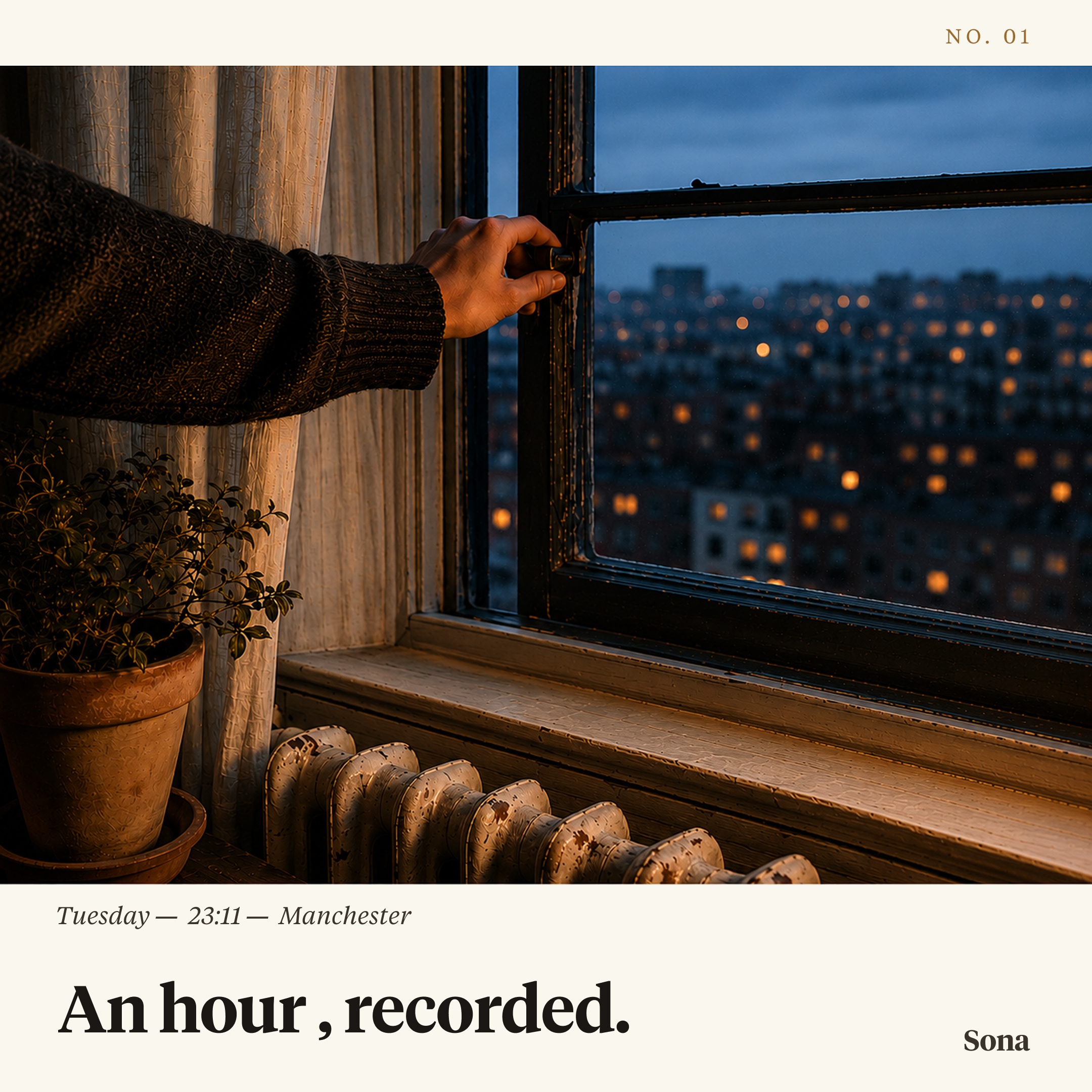
Before drawing a single form, I decided what Sona was not: not a gadget, not a wellness app, not aromatherapy. I built its world from publishing, bookmaking, photography, and type — editorial, restrained, exact — and the palette of ivory, ink, and ochre, the type, and the tone all came from here.
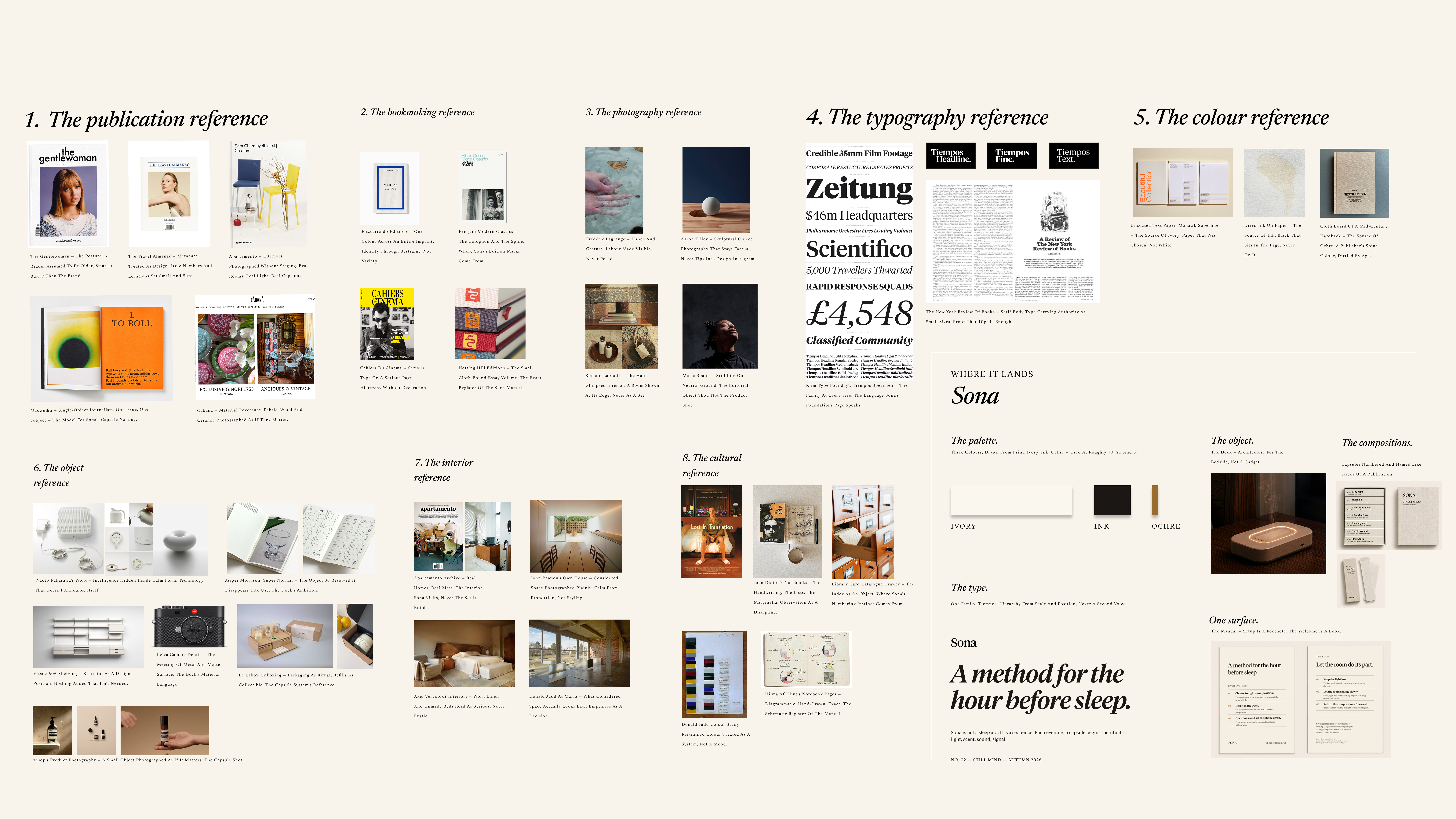
Reference imagery sourced and credited; the synthesis and direction are mine.
Sona isn't a single product, and it isn't a system in the operational sense — it's an ecosystem of four parts — dock, compositions, app, and brand — each owning a moment and passing to the next. I mapped the transition into five stages and gave each part a stage to hold, then hand on.
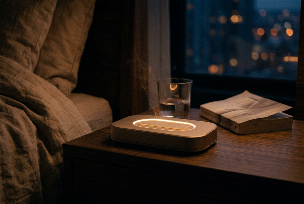
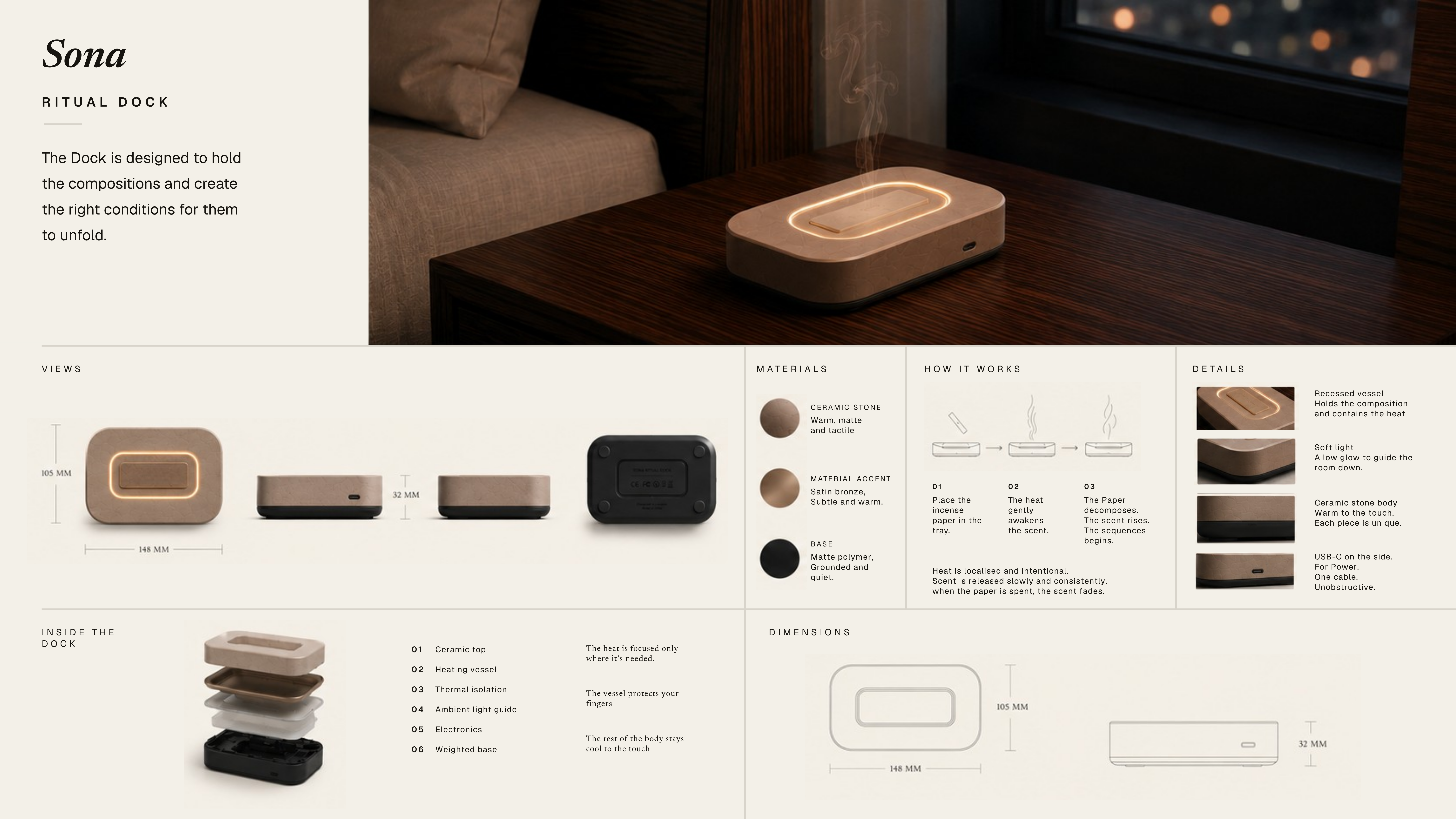
The hard part was resisting the obvious — a sleek tech device. A device asks to be operated; an object simply sits there and signals intent. So the dock reads as ceramic stone, warm and matte — something you'd own, not tend to — and disappears into the room, so the ritual, not the technology, is what the evening returns to.
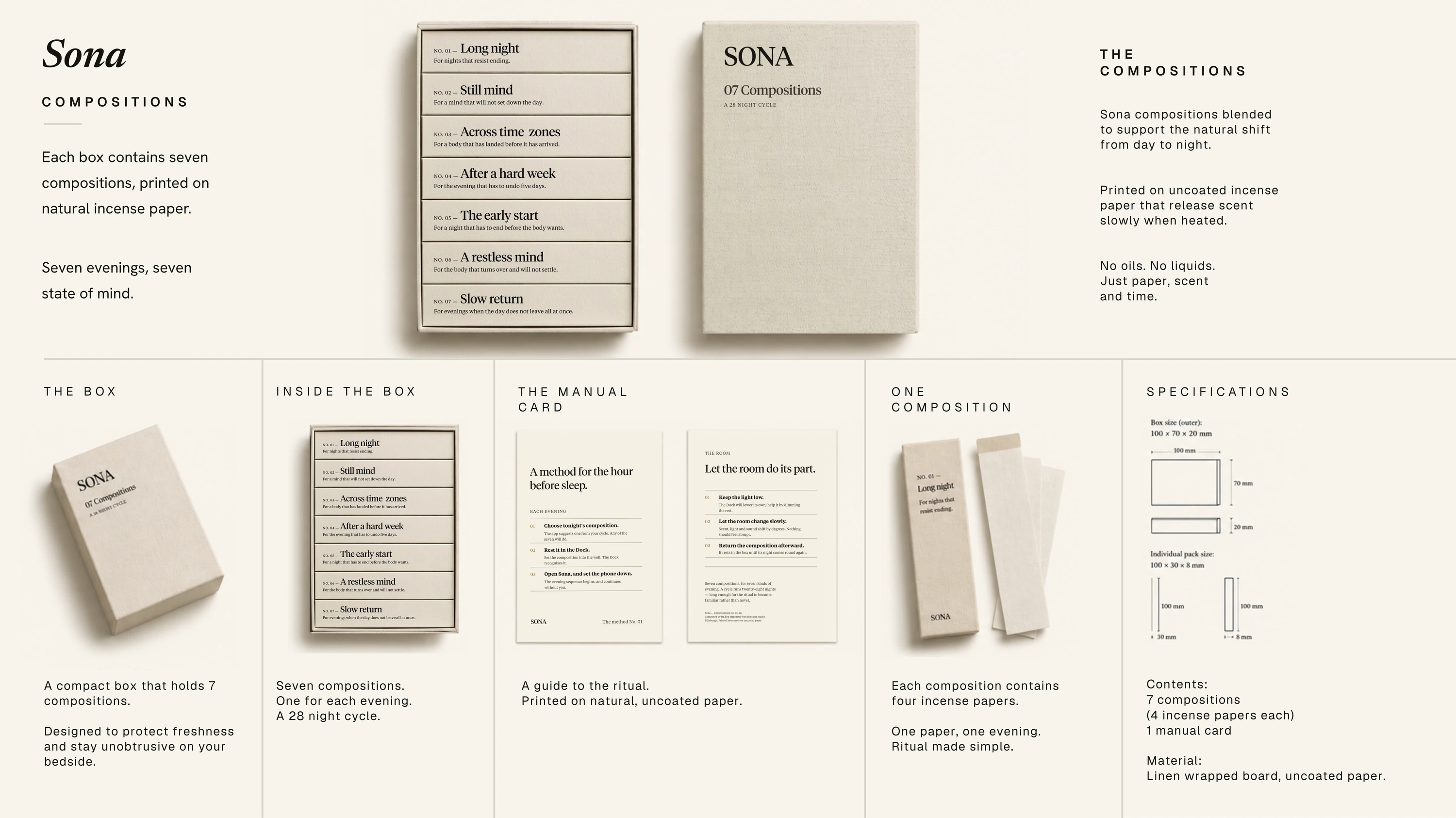
I started with fragrance capsules and oils, and rejected both — each instantly recast Sona as a supplement or an aromatherapy product. The answer was incense papers in a linen-wrapped box, indexed like a small publication: no oils, no liquids, just paper, scent, and time.
The brief asked for a companion app; the design problem was making it the kind you open once a night and then forget. A single job each evening — set the ritual, then disappear — ending in a screen that simply says: set the phone down, Sona will continue.
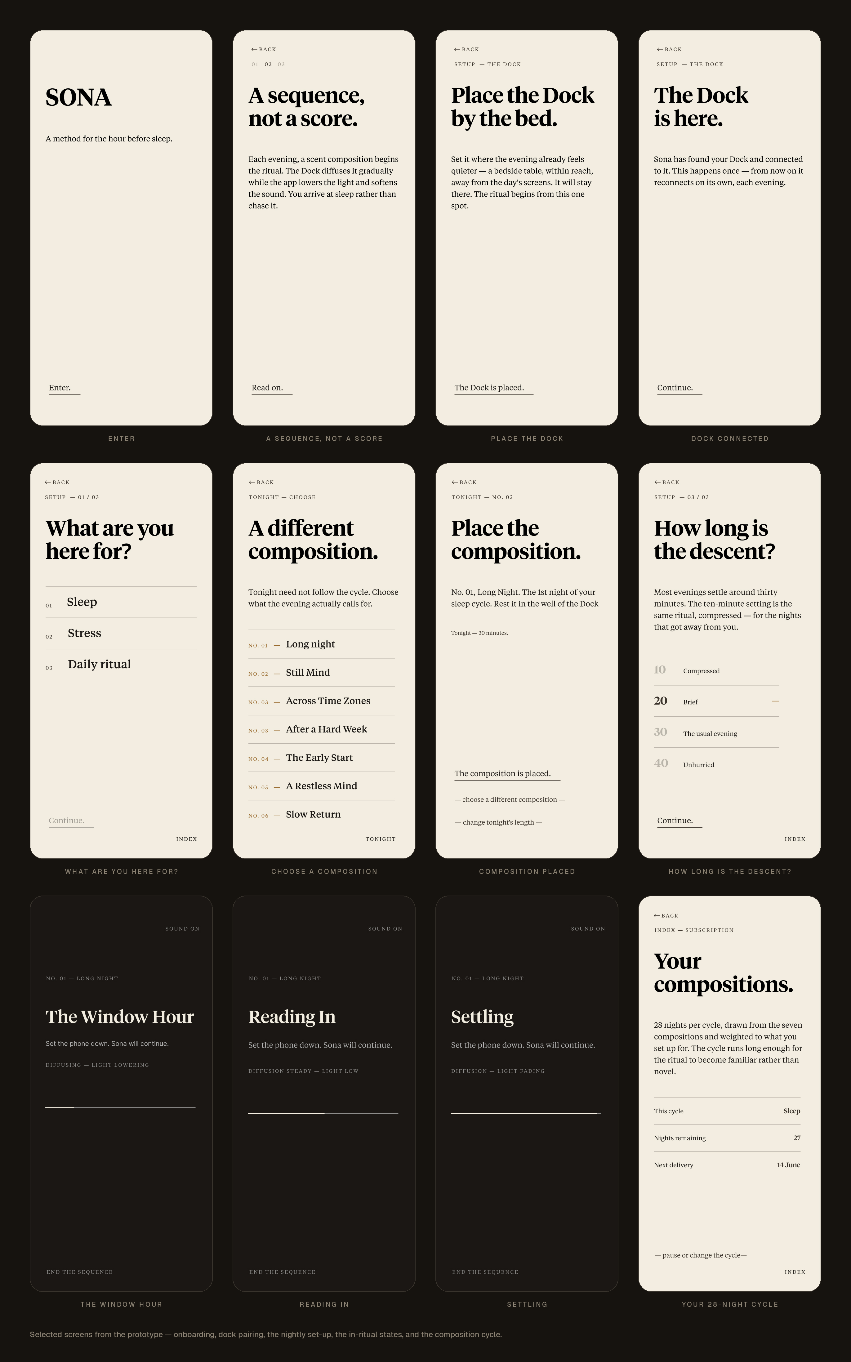
Beyond static screens, I built Sona's nightly flow as an interactive prototype — onboarding, set-up, and the ritual itself, click by click.
Best viewed on desktop. Set in Source Serif 4 — a freely-available stand-in for Tiempos, the paid font specified in the design but unavailable in the AI-assisted prototyping environment.
The brief called for a launch campaign, so the identity had to carry beyond the product — unhurried, exact, closer to a publication than a brand, selling a feeling rather than a feature. I set it against four tensions:
Campaign across formats — web banner, feed, square, and story.
Sona is a concept, not a validated product, and I'd treat it that way: before building anything, I'd test the core bet — does designing the transition actually beat optimising the sleep? — small and qualitative, in real bedrooms. The commercial questions, refill economics and retention, are what I'd model before it became a product, not after.
But the part that travels isn't the dock or the scent. It's the method: start from a behaviour the market has misread, identify the moment everyone else is designing around, and decide what to refuse before deciding what to build. That approach isn't specific to sleep. It's how I'd come at any category where the obvious products are all solving the wrong half of the problem — which is most of the categories worth entering.
Genie was a category rebuilt. Phoenix was a product made to punch above its cost. Sona is the one where I got to ask the earlier question: not how to make the thing better, but whether the category is even pointed at the right need.
Sole designer, end to end: problem framing, concept and form development, CMF, app UI and flows, brand identity and visual system, packaging, and launch campaign — brought together as an interactive prototype.
Designed over four weeks from a brief set in a design certification (Job Escape). The concept, product direction and ecosystem vision are mine. I worked with AI tools through the process — to explore research directions and to build the visualisation and art direction — directing the calls throughout.
Hiring or curious —
hello@toobaameer.co.uk
UK · FULL RIGHT TO WORK · ONSITE OR HYBRID UK-WIDE · REMOTE WORLDWIDE · DESIGN MANAGER / LEAD PRODUCT DESIGNER