Case study · Phoenix · Safari Industries · 2023—25

Phoenix

A premium read on a value cost base.

Safari is one of India's three largest luggage makers, and its strength is also its ceiling: the market reads it as value, not desire. The brief for Phoenix was to break that — to land a genuinely premium feel at a ₹9,999 retail price and a $30 manufacturing cost.

You can't buy premium for $30. So I had to build it instead — from the things that cost nothing extra: finish, proportion, restraint and detail.

The finished Phoenix trolley — 8-wheel, tonal black, brushed-metal hardware
The finished Phoenix trolley — 8-wheel, tonal black, brushed-metal hardware.
$30FOB cost target — held
₹9,999Premium retail tier landed
WinnerTravel Sentry Product Awards 2025
SoleDesigner · concept to production
RoleSole designer — concept to production
ScopeProduct · CMF · Construction · Specification
Category8-wheel laptop trolley
RecognitionWinner — Favourite Softside Luggage
01.The brief

A brief that contradicted itself.

The brief came from the marketing and product team, not from me. It asked for premium fabric and no prints, a detailed organiser, a lockable laptop and tablet compartment, and — tellingly — dimensions matched to the Samsonite Sefton. The aspiration was written into the spec.

Then came the two numbers that defined the whole project: a target retail price of ₹9,999 and a target $30 FOB — the cost to make and ship each unit. For Safari, ₹9,999 is the top of its range. For a Samsonite feel, $30 a unit is almost nothing.

The brief, read honestly, was a contradiction: deliver the perception of a premium brand on the cost structure of a value one.

Desired features, “premium fabric, no prints,” Sefton dimensions, and the price and cost targets
Desired features, “premium fabric, no prints,” Sefton dimensions, and the price and cost targets.
02.The problem

You can't buy premium at thirty dollars a unit.

Leather shells, aluminium frames, polycarbonate — the materials people associate with premium luggage — were all off the table at this cost.

So I reframed the brief. If premium couldn't come from spend, it had to come from the things that cost nothing extra: finish, restraint, proportion, and detail.

Premium as a design decision, not a materials budget.

03.Design principles

Four rules I held the whole way.

01Restraint over accentStop decorating. A premium object looks like it isn't trying.
02Tonal over colourDifference through material and texture, not a bright highlight.
03Finish over materialIf I can't change the fabric, I change every metal touchpoint.
04Make it makeableManufacturability is a design input, not a problem handed downstream.
Front, three-quarter, back and both sides — the object the four rules produced
Front, three-quarter, back and both sides — the object the four rules produced.
04.Exploration

Two roads I walked away from.

Premium isn't the first idea — it's what's left after you delete the wrong ones. Two early concepts taught me what Phoenix shouldn't be.

a.

A full-PU front.

The fastest way to look premium was to clad the whole front face in PU faux leather, and I built that version first. But a business trolley lives a hard life — dragged through airports, knocked at security, stacked into overheads — and a large faux-leather face is exactly where that shows. It scuffs, scratches and tears, and a marked “premium” panel reads cheaper than honest polyester ever would. Premium that can't survive its own use isn't premium. I walked away from the full-PU front; where the faux leather finally went, and why, is the first of the hard decisions below.

The full PU faux-leather front — built first, then walked away from
The full PU faux-leather front — built first, then walked away from.
b.

The construction was the problem, not the pocket.

The protruding pockets stayed — they're a strong design choice and a signature of the final bag. What I moved on from was the construction: pockets stitched directly onto a plain front panel. Visually it left the pockets sitting like applied objects, and structurally it carried a real production risk on curved seams over a flat face. I committed instead to the direction where the pockets are framed end to end by a PU trim line — cleaner, less complex, more finesse, and a build the factory could run consistently.

Protruding pockets stitched directly to plain front panel
Protruding pockets stitched directly to plain front panel.
PU trim line framing pockets edge to edge
PU trim line framing pockets edge to edge.

From “applied objects on a panel” to “framed within a trim line.”

05.The hard decisions

Three decisions that made Phoenix possible.

At $30 a unit you cannot make everything premium. The project lived or died on where the money went — and on what I was willing to sacrifice to put it there. Three calls did the heavy lifting.

01Spend where hands landThe premium budget went into one place: the brushed-metal hardware family and PU leather on the faces a hand actually touches — top handle, lower front, back panel. Everything else stayed ordinary polyester.A shopper reads premium through what they touch and see up close, not through panels they never handle. Concentrating spend at the touchpoints buys more perceived quality per rupee than spreading it thin.Traded: faux leather across the whole face, for premium exactly where it's felt.
02Reuse the construction, fix what's wrong with itPhoenix started from a previously-launched Safari construction (the laptop and tablet bay carried over from Brighton) rather than a new one — but I reworked the corner radii so the proportion read sharper and more deliberate.A new architecture means new patterns, sampling and sign-off, and that cost comes straight out of the finish budget. Reusing a proven construction sent every premium rupee into detailing rather than a new build — and correcting the radii bought a considered stance without paying to engineer one.Traded: a fully bespoke silhouette, for a corrected existing one with the savings redirected into finish.
03Buy signal, not decorationI dropped the bright accent and consolidated every metal part — logo, zippers, pullers, rivets — into a single brushed-metal language.A bright accent reads as “feature,” not premium; one coherent metal language reads as considered. Pay for what reads premium, cut what only looks busy.Traded: the loud “look how much you get for the money” cue some Safari buyers shop on. To a value shopper a busy bag can itself signal value, so going quiet was a real commercial risk — one the bag offsets through function, not noise: three face pockets and heavy internal organisation still read as “a lot of bag” without the clutter.
06.Aligning the team

A different read on premium.

Leadership and product management initially favoured the louder cues the category trains buyers to expect — red logo accents, full-PU front pockets, the Samsonite Sefton vocabulary. They weren't wrong about the references; those signals do work. The question I needed the team to consider was whether they were the right signals at this price, on this brand. Two conversations decided how premium Phoenix would actually look — and both were settled by putting evidence next to opinion.

a.

The red accent — show, don't argue.

The product team had the Samsonite Sefton in mind: red logo, red pullers, heavy PU detailing. Rather than push back in a meeting, I built both versions — with and without the red — and put them side by side. The comparison made the case that words couldn't. Stripped of the accent, the bag instantly read more premium, and the team aligned on the quieter direction quickly. The argument moved from preference to what the eye does.

b.

Premium has to survive ownership.

The same team wanted both front pockets in full PU leather — it photographs richly. I framed it through use, not taste: pockets that flex every day would crease, and within a few months that “premium” PU would make the bag read cheaper, not richer. The team aligned once the failure mode was named. We kept PU on faces that stay taut and removed it from the ones that move.

A point worth being honest about: reducing visual noise also reduces the surfaces where manufacturing inconsistency shows. At this cost target, restraint wasn't only an aesthetic argument — it was a quality-control one.

The moment I removed the red, the bag stopped looking like it was trying.

07.The material system

Premium, rebuilt as finish.

With the base fabric fixed by cost, I treated every other surface as a lever. The body stays a single tonal black; the only “colour” is a Pantone Cool Grey 7C stitch, kept on the panels and deliberately off the pockets, handles and smart sleeve so the seams read as tailoring, not decoration. PU leather goes only on the faces a hand actually touches — the top handle, the lower front, the back panel.

Body fabric, trim stitch, PU placement and hardware allocation, documented to specification
Body fabric, trim stitch, PU placement and hardware allocation, documented to specification.

One hardware family.

01Metal logoA solid badge, not a printed mark.
02Brushed zippersMetal pulls with a brushed finish across the pockets.
03Matched pullersOne puller language head to toe.
04Metal rivetsThe same brushed tone at every stress point.
05Tonal stitchCool grey on black — visible, not loud.

The point isn't any single component. It's that they all speak the same brushed-metal language, so there's no weak link for the eye to catch and re-file the bag as cheap.

08.Form & proportion

Designed by ratio, not by eye.

The front face is built on a unit grid — twin pockets at five units wide with a two-unit gap, the body laid out at twelve units tall by fourteen wide. Proportion is one of the quietest premium signals there is, and the cheapest to get wrong, so I specified it rather than eyeballed it.

Down to the details: a lifted, edge-stitched top handle, a neoprene base, two corner guards, an 8-wheel trolley, and a smart-sleeve clearance specified to the millimetre. Built on Safari's existing Brighton construction so it could reach production without bespoke tooling.

Front face dimensioned overlay — pockets at 5 units wide with 2-unit gap, body at 12 × 14 units
Front face dimensioned overlay — pockets at 5 units wide with 2-unit gap, body at 12 × 14 units.

The grid isn’t decoration. It’s the proportion that reads premium before any material does.

09.The experience

Where the bag earns its price.

A premium bag whispers “we thought about you” the moment it opens. Phoenix opens in two stages: the front panel folds down on webbing straps to reveal a dedicated laptop and tablet compartment, then the main compartment behind it.

Inside: an RFID-blocking fabric pocket, a dedicated power-bank pocket, a wet pouch, mesh organisation throughout, and number-5 reverse zips. And one controlled indulgence — the red I took off the outside, brought back inside as a single webbing pull with a gun-metal key holder, where the accent costs little and the delight is private. Restraint outside, a small reward within — the same colour, moved to where it reads as care rather than as a value cue.

Front panel folded down on its webbing straps, the dedicated laptop and tablet bay revealed
Front panel released on its webbing straps; padded laptop sleeve and tablet bay revealed inside.
Twin front pockets, laptop bay and main compartment, walked through
Front pockets 01 and 02, front-panel pocket 03, laptop compartment 04, main compartment 05.
Front panel folds to the laptop and tablet bay; the main compartment opens behind it — mesh, RFID, wet pouch, webbing pull
First opening reveals the laptop pocket, tablet holder and mesh pocket; second opening reveals the main compartment, wet pouch and front-panel webbing straps.
10.Production

Premium that survives the factory.

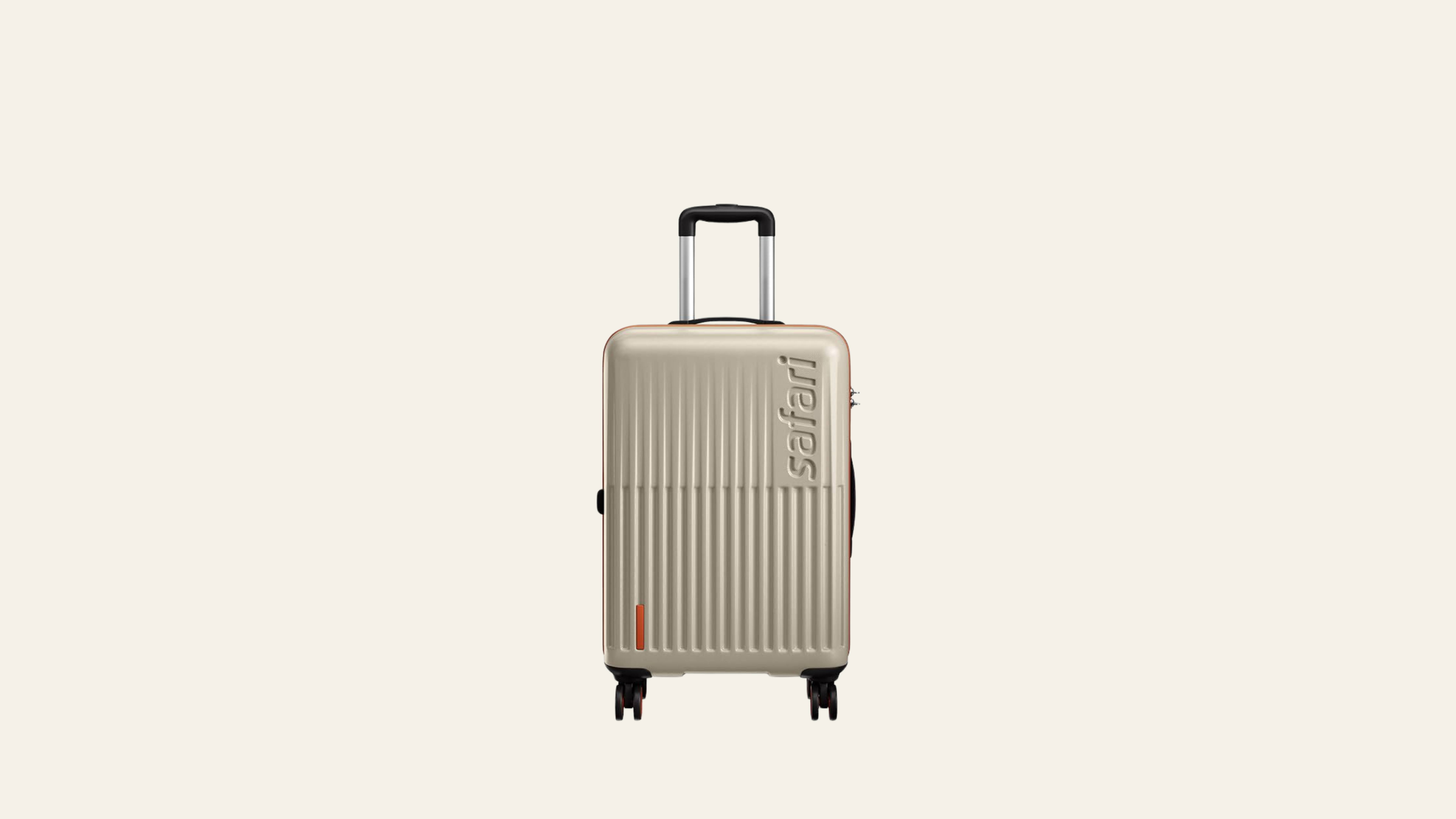
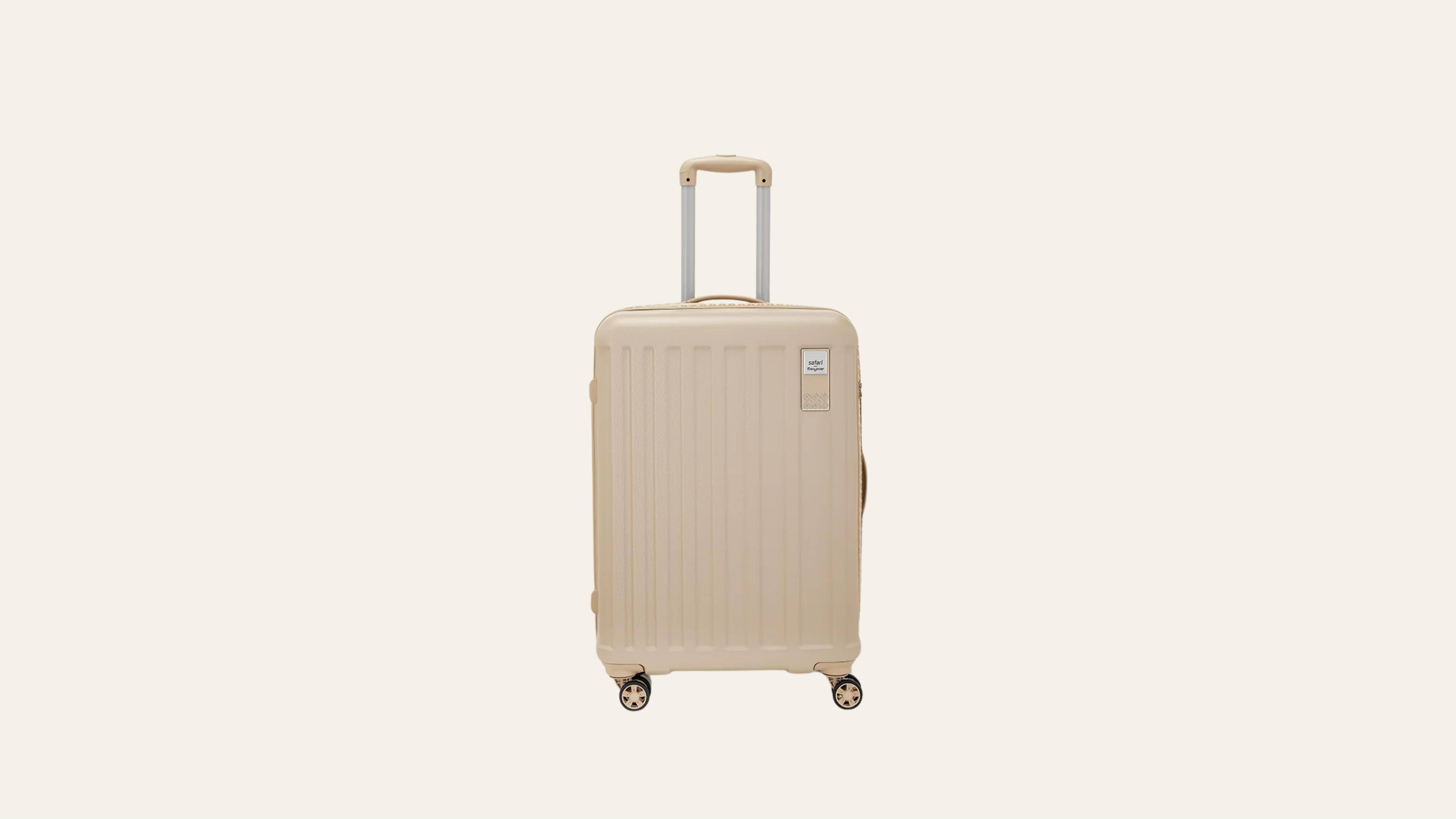
The trickiest moment in the build was the front pockets. An earlier version had them stitched directly onto a plain front panel — visually unframed, structurally risky: curved seams on a flat face pucker, slow the sewing line, and fail QC. Left in that form, it would have surfaced as a cost and quality issue at sampling.

Rather than try to engineer around that build, I committed to a different construction — extending a PU trim line edge to edge so the pockets sit inside a frame, not on top of a panel. The framed version reads more resolved and sews clean. Around it, every component was drawn from families Safari already tooled — Aphrodite hardware, Polaris wheel caps, a Ballpark trolley — so nothing premium needed new tooling. The whole thing went to the factory as a 13-page technical pack, complete enough to build without me in the room.

Finish also had to win a cost argument. Sourcing pushed back on the metal hardware at $30 FOB, so the components were reworked to hold the look without the spend — the rivets, for instance, are hollow-cored: the same brushed face, less metal, a lighter bag. Premium where it shows; engineered out where it doesn't.

$30FOB · held
₹9,999Retail tier
13Page spec pack
8Wheels
210DLining quality
0Prints · accent colours
Snapshot of the 13-page manufacturing pack, written for the factory to build without me in the room
Snapshot of the 13-page manufacturing pack, written for the factory to build without me in the room.
11.How it shipped

Design sat alongside production, not upstream of it.

Phoenix shipped because design didn't sit upstream of production — it sat alongside it. Five working partnerships, each with the standing to change the bag, kept the premium read intact from sketch to shelf.

01Product managementSet the cost, retail tier and feature list. The agreement we built: features earn their place against the FOB; restraint isn't a missing feature.
02Category & marketingOwned the shelf and the channel forecast. Brought them into the alignment early — colour direction, hardware family, packaging — so the launch case wasn't a surprise.
03SourcingNegotiated against the $30 FOB. Where they pushed back on hardware cost, we re-engineered (hollow-cored rivets, brushed face preserved) rather than re-styled.
04Factory developmentFlagged the curved-seam risk on the unframed pocket version early enough to redirect the build, not patch it. The framed-pocket construction we committed to improved both the read and the line speed.
05Manufacturing partnerBuilt the bag in China. The 13-page spec pack was written for them to build without me in the room — but the relationship survived a Canton Fair visit, sample rounds, and real conversations about tolerance versus intent.

The product succeeded because design, sourcing, manufacturing and category aligned on the same outcome — not because any one of us insisted on it.

12.Outcome

A value brand, holding a premium read.

Phoenix was made deliberately in low volume — an expensive product on a cautious forecast — and demand ran ahead of it. It has sold through and reordered, and sells out fast across Safari's own site, Amazon, Flipkart and Myntra whenever it returns to stock. It also took first in its category — Favourite Soft Side Luggage — at the Travel Sentry Product Awards 2025.

The clearest verdict was internal: the tonal, restraint-led approach didn't stay with one bag. Safari carried the same design language into its slings and laptop bags — a single brief's answer became a direction.

13.Business impact

Design that earned pricing power.

Phoenix was briefed at a ₹9,999 retail tier. Internal confidence in landing that price was cautious — Safari's market read is value, not desire, and the premium positioning was untested in the category. The first production run was kept deliberately small to protect against dead-stock risk.

Retail acceptance ran well ahead of forecast, reorders came in, and sell-through outperformed the cautious case. On ecommerce, the realised price moved past ₹10,000 without losing traction — strengthening contribution margin against plan. These figures aren't public, so I don't publish them here, but each is verifiable on request, and each is exactly what the design was asked to make possible.

The longer-signal of confidence was that the language travelled. Safari extended the same tonal-restraint direction into slings and laptop bags — a single brief's answer became a category direction. Design didn't just deliver the product; it created the conditions for the brand to price and position differently.

14.Reflection

What I'd push next, and what I take into the next brief.

If a future brief loosened the cost, the first thing I'd change isn't the hardware — it's the base fabric itself, so premium runs through the whole shell and not only the faces a hand finds.

Phoenix sold out — but in deliberately small numbers, and with few reviews behind it. The honest open question is whether restraint scales: did the quiet version win on merit, or because it stayed a low-volume, self-selecting buy? Before assuming quiet always reads as premium to a value-brand shopper, I'd test it against a louder version at shelf, at real volume.

What I take into the next brief.

01Proportion before detailGet the silhouette right and most of the work is done.
02Surface disciplineEvery seam, stitch and panel line earns its place.
03Material honestyInvest in the few signals the hand and eye trust, and don't fake the rest.
04Visual noise reductionWhen craftsmanship budgets are tight, remove the opportunities for inconsistency rather than decorate around them.

None of these are luggage-specific; they're how I'd come at the next category too.

15.Role & scope

What I made, honestly.

Sole designer on Phoenix, from a marketing brief to a production-ready specification. The visualisation here is mine; AI was used only to communicate finish and intent, never to engineer the product.

Owned end to end
  • Interrogated the brief and named its core contradiction — premium feel, value cost.
  • Concept exploration and the decision to remove colour in favour of material.
  • The full CMF system — body, trim, PU placement and the brushed-metal hardware family.
  • Form, proportion and construction on the Brighton platform.
  • The complete 13-page manufacturing pack and factory hand-off.
  • Aligned product, sourcing, factory and category teams on a direction that delivered the retail tier — and the pricing power that followed.

Phoenix taught me that “premium” isn't a material — it's a system where no single touchpoint betrays the price.

16.Additional products shipped

Phoenix is one of several products I've taken to market.

The operating principles behind Phoenix — constraint-led decisions, CMF as the primary lever, form direction held through development — have applied across multiple launches. Below is a selection of work currently live in retail and D2C.

Original design — form, CMF, development.

Products where I defined the form language, architecture and CMF. Engineering CAD executed in collaboration with a specialist CAD designer.

Astra Neo
Safari · Hard-shell trolley

Astra Neo

Lead designer — form direction, ribbed surface architecture, colour-accent CMF and development. Engineering CAD in collaboration.

View on Flipkart →
Theo
Genius · Hard-shell trolley

Theo

Lead designer — form concept, youth-lifestyle CMF direction and development across the Genius range. Engineering CAD in collaboration.

View on Amazon →
Scarlett
Genie · Hard-shell trolley

Scarlett

Lead designer — diagonal wave shell concept, ombré CMF direction and full product development. Engineering CAD in collaboration.

View on Genie →

CMF & creative direction.

Products where I directed the colour, material and finish on an existing shell. The CMF decision — which colours move, which finishes sell, which direction the brand should read — is design work. The shell engineering was someone else's.

HueSafari · Printed hard-shell trolley

Hue

CMF direction — print concept, ink-wash pattern development and colourway selection across the range. ~8,000 units sold monthly on Flipkart (June–September 2025).

View on Flipkart →
EternaSafari × Manyavar · Wedding collaboration

Eterna

Creative direction — established the look, feel and visual identity of the collaboration. CMF, surface detailing and brand tone defined under my direction. Final execution led by the team following my departure.

View on Safari →
Next projectSona

Designing the hour before sleep — a self-directed concept for a category that doesn't yet exist. Object, scent, app and brand, designed to hand off across one experience.

Connect

Hiring or curious —
hello@toobaameer.co.uk

UK · FULL RIGHT TO WORK · ONSITE OR HYBRID UK-WIDE · REMOTE WORLDWIDE · DESIGN MANAGER / LEAD PRODUCT DESIGNER