Case study · Safari Industries · 2021—2026

Genie

Growing a school-bag brand up with its customer.

When I took over design for Genie in 2021, it was a kids' school-bag label. Five back-to-school seasons later it was a brand a teenager would choose for herself. I rebuilt its design language and range so the brand could grow up with the girl carrying it — from her first big-school bag to college — and led that work end to end, from consumer research to the factory floor. Over those five years the brand grew around six-fold across backpacks, luggage and handbags.

Genie Before 2022 and Now 2026 — backpack range evolution showing florals and graphic prints transitioning to structured, muted Korean-aesthetic designs

Same brand, grown up — from florals and one primary cohort to a range built around construction, surface technique and maturity. A backpack a teenager chooses for herself.

~6×Brand growth
2021—2026
3 → 9Ranges in a
back-to-school season
21 → 84SKUs per
back-to-school range
1 → 6Sales channels
operating model
RoleDesign & Development Manager · sole design owner of Genie
ScopeConsumer research → range strategy → CMF → manufacturing → launch
CategoriesBackpacks · teen & college · soft & hard luggage · handbags
Period2021 — 2026 · five back-to-school seasons
01.The challenge

A brand that kept losing the girl it won.

Genie was known for one thing: school bags for little girls. The identity was narrow by design — "girl" meant florals, florals meant young, and the whole range spoke to a seven-year-old.

The problem wasn't the label. It was what the label cost. Genie's range was roughly 85% florals — the rest a scatter of geometric motifs with no real identity of their own. Florals meant young, and young was the whole brand. So the girl Genie won at seven aged out of it fast. Our own research was blunt about it: by fourteen she wanted a bag with the function of a school bag but the look of a fashion bag — and Genie didn't make that. It won a customer early and handed her to someone else a few years later, year after year.

That made the real challenge a strategic one, not a cosmetic one. To grow, Genie couldn't just look better. It had to grow up with the girl carrying it — earn her at seven, keep her at fourteen, and still be the bag she chose for college. One brand, one design language, stretched across a customer who was changing faster than the range was.

Everything else followed from that decision: a range rebuilt every season, demand bet across ninety-odd designs in a four-month window, and a visual language that had to widen without losing the brand. But the root problem was identity — and identity is a design problem.

8Designs in the
inherited range
85%Florals — by volume,
by identity
1Primary cohort served
Genie school range before 2022 — eight backpacks in floral and graphic prints
The range before 2022 — eight designs, almost entirely floral and graphic prints. Saturated, sold on volume, with no consistent design language to hold it together.
02.Understanding the next generation

The same girl, five years apart.

To grow Genie up with its customer, I had to know exactly how she changed — and where the brand lost her.

Cohort insight came from a commissioned qualitative study — nine in-depth interviews across ages seven to fifteen — supported by ongoing consumer immersion across markets, online and in person, to stay close to how the brand's customer was actually shifting. We didn't ask what bag she wanted. We looked at what she already carried, what she watched, who she copied, and who decided the purchase.

The arc that came back wasn't gentle. At seven, she lives in a fantasy world — Frozen, unicorns — and Mum makes the call. By ten or eleven she's the same girl, louder and more expressive, but now she chooses and Mum approves. Then, at fourteen, the break: she rejects "school bag" outright. She wants the function of one and the look of a fashion bag, and she knows exactly what's on trend because she's watching it all day.

That break was where Genie was leaking customers. She'd carried the brand since she was little, and by the time she stopped wanting to look little, a gap had opened between what Genie made and who she'd become. Closing that gap became the most important thing the range had to do.

01The fantasy worldAges 7—8A 19″ bag carrying a tiffin, a pouch, and up to twelve books. The brand sized her into its biggest format and dressed it in fantasy — she was given scale she hadn't asked for and a world she had.
02The personalised bagAges 10—11An organiser she's filled herself: charms, keychains, stickers, a pouch tucked inside the pouch. She was personalising a bag that was never built to be personalised.
03The function-identity gapAges 14—15Money, lunch, a phone, books. The bag had become an accessory she carried all day, but it still looked like a school tool. A gap emerged between function and identity.
Cohort board — the girl Genie was designing for, across ages and everyday moments
The cohort — who Genie was actually for, and the moments the bag had to carry her through, from first big-school day to college.
The audit is why the products changed. The progression is why the brand had to.
03.Cultural signals & trend forecasting

The trend was the input. The judgement was the work.

By 2023, Korean culture was visibly rising across India — K-dramas, beauty, fashion, the lot. K-drama viewership had climbed sharply over the pandemic years, and the influence had moved past the metros, reaching smaller cities through the same phones every girl in the research was watching all day. Every competitor saw the same wave. Spotting it was not the work.

The obvious move was K-pop — idols, band references, the fandom. I didn't make that bet, for two reasons. First, the research had already caught it ageing: the older cohort had grown out of K-pop and treated it as a younger girl's phase. Second, and more decisive, was lead time. A Genie design moved from research to shelf over roughly twelve months. Anything peaking the week I briefed it could be cold by the time it reached the shelf. A faddish bet here doesn't just underperform; it ships as dead stock.

So I separated two things the trend had folded together. Fandom — attachment to specific idols and groups — was fast, narrow and ageing. Taste — the muted Korean palette, soft minimalism, the tactile considered finish of the aesthetic — was slower, broader and still climbing. I built on the taste and left the fandom alone. The products that came out of it read as Korean in feel, never as K-pop merchandise.

Cultural signals trend board — Asian Aesthetic
The Asian Aesthetic trend board. Reference imagery sourced and credited; the analysis and direction are mine.
Print and surface trends, 2023 to 2026, read season by season
Print and surface trends, 2023–2026 — read season by season, ahead of the factory calendar. The broad aesthetic board sets direction; this tracks what actually moved, year on year.

That distinction is the whole section. The skill wasn't seeing the Korean wave. It was deciding which part of it was durable enough to commit factory months and unit bets to, and which part would age out before it ever reached the girl carrying the bag.

01Fandom or taste?Fandom attaches to people and ages out with them. Taste changes how everything looks and stays. Idols were fandom; the muted palette and considered finish were taste. Built on taste.
02Metro or mainstream?A signal trapped in the metros is fragile. The Korean aesthetic was already aspirational well beyond them, in the cities Genie actually sold to. Built on the broader signal.
03Faster or slower than the factory?Anything peaking before a twelve-month cycle can ship is a loss before it starts. Idol cycles move in weeks; a taste shift moves over years. Built on the slow one.
04.Translating trends into products

The aesthetic was the easy part. The price was the design problem.

The decision from the previous section — build on Korean taste, leave Korean fandom alone — sounds clean on a slide. The market it had to land in wasn't clean at all.

By the time I briefed this range, Korean-style backpacks were already on Amazon at a fraction of Genie's price point — listed by sellers buying directly from Chinese suppliers, often unbranded, riding the same aesthetic. A Genie bag with a muted palette and a Korean feel was going to retail at a multiple of those, and the consumer it was for could see both options on the same screen. The aesthetic alone wasn't going to defend the price.

So the brief I set myself was harder than "design a Korean backpack." It was: make a backpack that reads as a different proposition, not a more expensive version of one she'd already seen. Anything less and I'd ship a bag that looked like a premium-priced copy of something already cheaper — the worst commercial position a design can be in.

Which meant the Korean call couldn't sit on a single variable. A new fabric on a familiar silhouette would have read as a finish change on a known shape. A new silhouette in the existing palette would have looked like the same brand in different clothes. Each lever, moved on its own, lost. They had to move together.

01ConstructionA new silhouette built specifically for this line, distinct from the Genie shapes already on shelves. The first signal, from across a store, that this was something different.
02FabricA disruptive material brought in inside the season's fixed-vs-disruptive ratio. Chosen for tactility and finish, not novelty — the Korean aesthetic reads as considered, not loud.
03PaletteMuted, away from the brand's pastel-and-saturated language. The colour story carried the Korean signal more than any print could.
04Features & finishDetailing tuned to read as designed-on-purpose, not decorated. The accent layer that confirmed what the first three were telling her.

In a category where the cheap version already existed, distinctiveness was compound — and that was the design problem. That logic — move four levers together because moving one isn't enough — is what made College Korea Genie's, not a more expensive copy of what Amazon was already selling. The Korean signal didn't decide what the product looked like. The market the signal was landing in did.

2025 and 2026 Korean-aesthetic backpack ranges
The 2025 and 2026 ranges that came out of the taste-not-fandom call — 17″ college, 18″ teen, and the College Korea family. Built on the durable signals; no K-pop borrowing.
05.Building a collection system

Five years of growing a system.

Designing a back-to-school range every year on fast-fashion economics is not a design problem. It's an architecture problem. I designed a system that had to grow with the brand. Then I grew it.

05a

What designs needed to exist.

The cohort research from the previous section didn't just tell me how the girl was changing. It told me what the range had to do at every age she'd be carrying it. Each cohort got designs that read as theirs — not as a smaller or louder version of someone else's. That was the demand side of the system: the range answered the customer the audit found, at the sizes she was actually carrying.

05b

How they got built affordably enough to ship.

Knowing what designs needed to exist was the easy part. The hard part was building a season's worth every year on a target cost that competed with unbranded products and a four-month selling window that punished any waste. The range couldn't be a set of separate design problems. It had to be one problem with many outputs.

I formalised the architecture across three locked rules. The brand's existing twill stayed as the base fabric — that constraint I inherited. The rest, I built around it.

0120 component colours, ≥2 backpacks eachBody fabric, elastic, zippers, air mesh, webbings, ladder locks, thread — all matched into one palette per season, every colour amortised across at least two bags. No SKU carried a colour MOQ on its own.
02~80% fixed fabric · 2—3 disruptive across 2—3 bags eachThe disruptive fabrics paid for themselves because the MOQ was shared. Innovation became affordable instead of expensive.
03Platform-and-component thinking, not new shapesDesigns built by varying print, palette and components on shared silhouettes. The architecture that made a growing range commercially possible.
05c

Five years, year by year.

The architecture was the same across five years. The shape of the range that came out of it was not. The system grew, contracted, reframed and matured as the brand grew with its customer. Across five years, never more than three constructions live at once. Every addition, retirement and simplification was tied to a specific commercial reason.

Five-year growth · Construction discipline held

The system grew. The architecture didn't.

SKUsDesignsRangesConstructions
Never more than three constructions — five years runningDesigns & SKUs deliberately lowerSIMPLIFICATION2181901048415414754492022INHERITED2023VOLUME2024TELEGRAPHED2025SUBSTITUTION2026SIMPLIFY
SKUs grew nearly 5× from 2022 to the 2025 peak; constructions never exceeded three. The 2026 retraction in designs and SKUs is deliberate simplification, not contraction — the system was being tightened, not the business.
YearPhaseConstructionsRangesDesignsSKUsAnnotation
2022Inherited baseline231521Trade only. Basic carried the brand identity; 16″ Supreme served the entry price point.
2023Volume response374181Added 19″ Max as a separate 40L construction for consumer volume. Split CORE into HP and RC — two needs at one price point. Hero designs: Cool, Amore, Sass.
2024Telegraphed exit374790Supreme's margins below double-digit floor. Reduced its SKUs and signalled retirement to dealers a full year ahead. Managed retirement, not surprise cut.
2025Substitution3954104Launched Teen at deliberately different sizes — 17″ College, 18″ Teen, College Korea. Supreme retired; Teen filled the gap before dealers felt it.
2026Simplification3949 (29 mine)84 (58 mine)Teen collapsed into 17″/19″ rhythm. From mid-2025, my successor Shital produced the remaining 20 designs / 26 SKUs operating inside the constructions, ranges and cohort logic I'd defined.
The Genie range evolving from 2022 to 2026
The same five years, seen as product — every addition, retirement and simplification the chart and table describe, evolving in one frame.
05d

One operating model, six channels.

Trade was the case study's deepest evidence. The same operating model also carried into five other channels — hypermarket, ecommerce marketplace, ecommerce outright, quick commerce, and retail. Each ran its own design counts, price points and calendars inside the broader system. The architecture held; the distribution scaled.

Core operating modelPlatform & components, cohort logic, sampling protocolOne architecture, scaled across six commercial channels with their own design counts, price points and calendars.
CH 01TradeBack-to-school spine
CH 02HypermarketV-Mart, Reliance Trends, D-Mart
CH 03Ecom marketplaceAmazon, Flipkart, Myntra
CH 04Ecom outrightDirect-to-consumer
CH 05Quick commerceBlinkit
CH 06RetailOwned stores
2026 collection — three constructions, nine ranges, four cohorts
The 2026 collection — three constructions, nine ranges, four cohorts. Platform architecture and lead design: mine; 58 of 84 SKUs by me, 26 by my successor under the architecture I'd authored.

When the cost-down ran out, the range had to give.

The 2023 PM brief carried one new consumer signal: raincover, as a feature, was no longer optional. The category was offering it. Genie had to.

That brief landed on a range already carrying happy pouch — a small pouch that clips to the outside of the bag for a girl's coins and lip balm. The two features do completely different jobs: happy pouch carries small bits on the outside; raincover shields the whole bag in the monsoon. What they shared was a cost. At component level raincover landed at fifty cents, happy pouch at fifty-eight — near-identical lines on a bill of materials that wasn't allowed to grow. The target FOB hadn't moved, but a feature was being added to an existing range at the same cost, so carrying both on one bag would have broken the price the brief had locked.

06a

Every cost-down lever was already spent.

The obvious response to a cost squeeze is to take the rest of the bill of materials down. There was nothing left to take down. Pullers, mesh, webbing, logo, thread — all at base. Construction and fabric consumption were fixed by the silhouette. Size was locked: 19″ CORE was the platform's structural anchor, and shrinking it would have read in trade and at point of sale as a downgrade, not a refinement. That left one lever. The fabric.

06b

The fabric was the line we couldn't cross.

Genie ran on cotton-backed twill — not as a finish call, as the brand's structural differentiator. In a category where unbranded competitors were sourcing direct from the same Chinese suppliers, the fabric was what held a customer's hand on a Genie bag rather than the bag next to it. Competitors operated at lower price points because they didn't carry that fabric identity. Moving Genie to PU-backed would have moved Genie into their cost structure — and into their commodity position.

To show the sales team what a PU-backed Genie would actually look and feel like as a trade product, sourcing and I developed a PU-backed trade sample of the same bag. The sample made the case concrete. In trade, where dealers and consumers pick the product up before they buy, the fabric is a deciding signal. The PU-backed version sat against unbranded competitors without the difference being visible. Taking the fabric down wasn't a margin save. It was a brand-level surrender.

01Raise the priceRejectedSales pushed back. Competition was already priced below Genie. A further price step would have shifted the bag out of the consideration set in trade, where price visibility against unbranded alternatives is high.
02Downgrade the fabricRejectedThe PU-backed trade sample had answered this one already. The cost of the move was the brand itself, not a few cents on the bill of materials.
03Split the rangeChosenTwo propositions at the same quality tier — same fabric, construction, size, price band. One carrying happy pouch. One carrying raincover. The customer got the feature they came for. The brand kept the thing it was built on.
06c

The call.

I proposed the split. The team aligned on it. 19″ CORE became CORE(HP) and CORE(RC) — the platform variants that still anchor the range three years on. The fabric stayed. The cycle margin held without taking the consumer price up. Dealers got a feature-choice within the same price band, rather than one feature forced to displace the other.

When the bill of materials wouldn't bend, the architecture did. The fabric identity held.
07.Designing backpack collections

The system in evidence.

The system architecture had to show up in the product itself. Below are the design moves that carried it — how the floral language grew up, how construction did the work a print used to, and how the brand started reading as premium from across a store. Not the whole range; the decisions that prove the system held.

07aMaturing the floral language.

Genie had been roughly 85% florals. The move wasn't to drop them, it was to grow them up: the floral language matured rather than disappeared — same identity, more restraint, less literal. It proved the brand reframe didn't mean abandoning what already worked; it meant making it read older.

Floral language matured
The floral language matured — same identity, read older.
Happiness wasn't a colour. It was a posture.
07bThe age-up move — Korean construction.

The elevated Korean construction, read at close range — tactile, considered, deliberately not loud. It's the first signal, from across a store, that this isn't another school backpack. The age-up didn't come from a louder graphic; it came from how the bag was built.

Korean construction detail
Korean construction: the age-up came from the build, not a louder graphic.
07cEbony — a denim look without the denim.

Ebony took a fashion-led denim texture and achieved it through digital print rather than real denim fabric. Actual denim would have added weight and cost and compromised the bag's job — a school backpack is carried all day and has to stay light. The print delivered the fashion read while the bag kept doing what a school backpack has to do.

Ebony denim-texture digital print
Denim texture by digital print — the fashion read without the weight.
07dConstruction as colour-block.

The side panels were aligned so the construction itself created clean colour-blocking — the seams doing the work a print would otherwise do. Precise alignment is what separates a colour-block that reads premium from one that reads cheap. The perceived value came from the build, not from added decoration.

Construction-aligned colour-blocking
Construction aligned for clean colour-blocking — premium from precision, not decoration.
07eNightsky — detail instead of print.

Nightsky used quilting and a quirky puller as the design element, in place of a print. A non-print move widens who the bag is for — it reaches the child who wants something tactile and distinctive over something graphic. The detail, not the print, became the reason she chose it.

Nightsky quilting and puller detail
Nightsky — surface technique as the design element, not a print.
3Constructions
9Ranges
49Designs
84SKUs

2026 collection. Of 49 designs and 84 SKUs, I designed 29 designs / 58 SKUs; my successor Shital produced 20 designs / 26 SKUs inside the system.

08.Expanding into adjacent categories

The brand stretched across formats. The market told us how far.

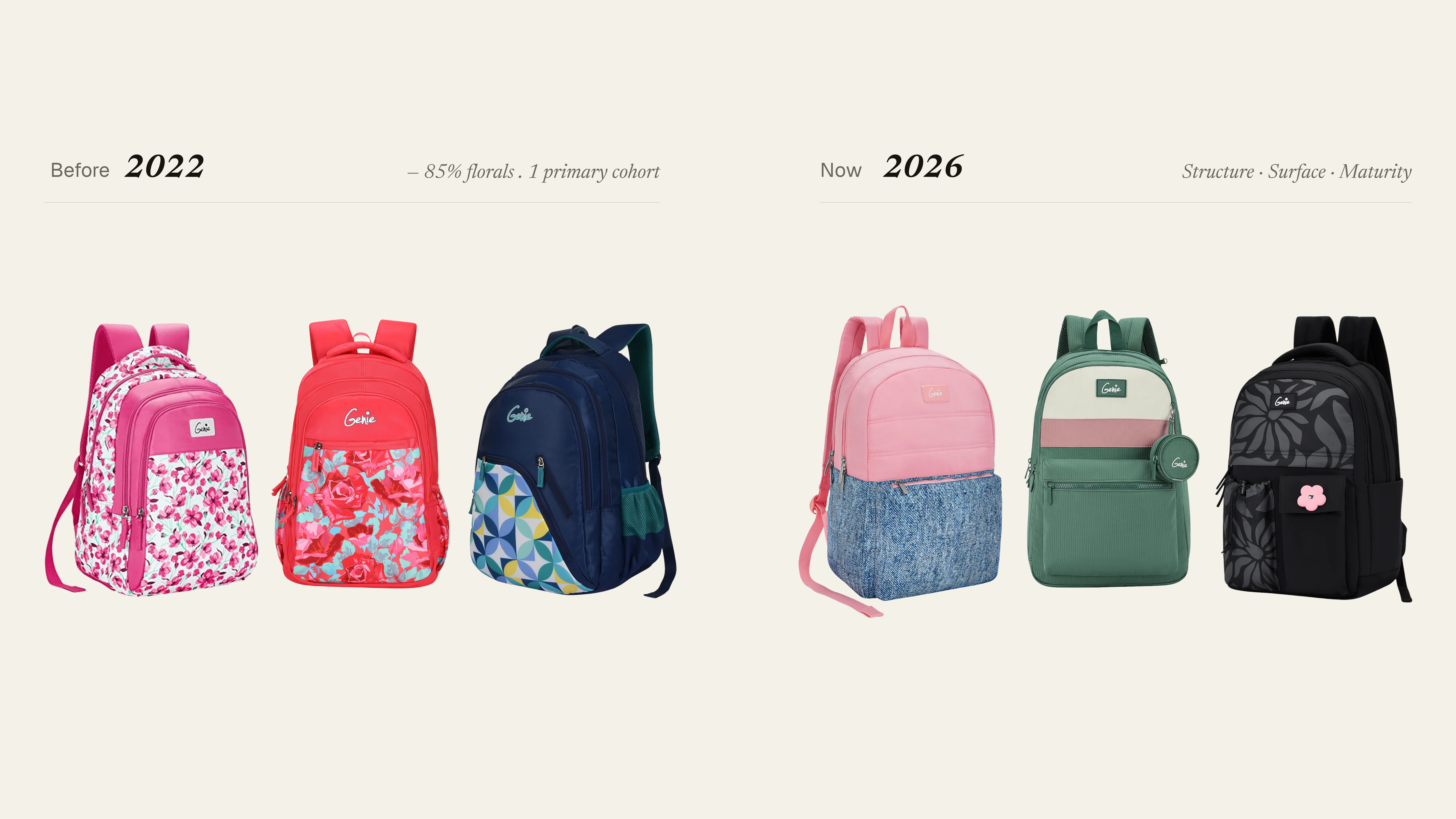
Luggage was one of the first things I did at Genie — before I rebuilt the backpack range, before the Korean call, before the operating system. The brand had committed to a luggage launch, and the brief came in as two ladders. Hard luggage ran three price points: Palm at value entry, Sprout and Rose (both at the same price point) through the mid-tier, Glam at the top. Soft luggage ran three: Lily at entry, Bahamas in the middle, Hazel at premium. The question was the same in both — what Genie's design language looked like in a category it had never been in.

I analysed the brand on arrival and made the translation call: take what made Genie Genie — its visual sensibility, its feminine-led identity, its print-led design language — and carry it into luggage. The forms came in collaboration with another designer; my work was the design direction, the CMF, and the brand-coherence call across the four ranges. Among India's branded luggage players, we were the first to put deliberate feminine prints on shelf.

The brand didn't have the budget or timeline to do formal consumer research before launch. So we did the next-best thing: we shipped what we believed in and used the market itself as the research instrument. Some of the printed ranges sold exceptionally — proof that the brand's identity travelled. But the niche turned out to be smaller than we'd hoped, and the volumes didn't scale to where we needed them.

So we calibrated. Heavy prints made way for ombres, glitter films, texture plays — the same brand sensibility, said more quietly. The brand could still be read as Genie at twenty paces; the addressable market widened. That recalibration carried through Scarlette, Diana, the later Palm work in 2026.

Hard luggage
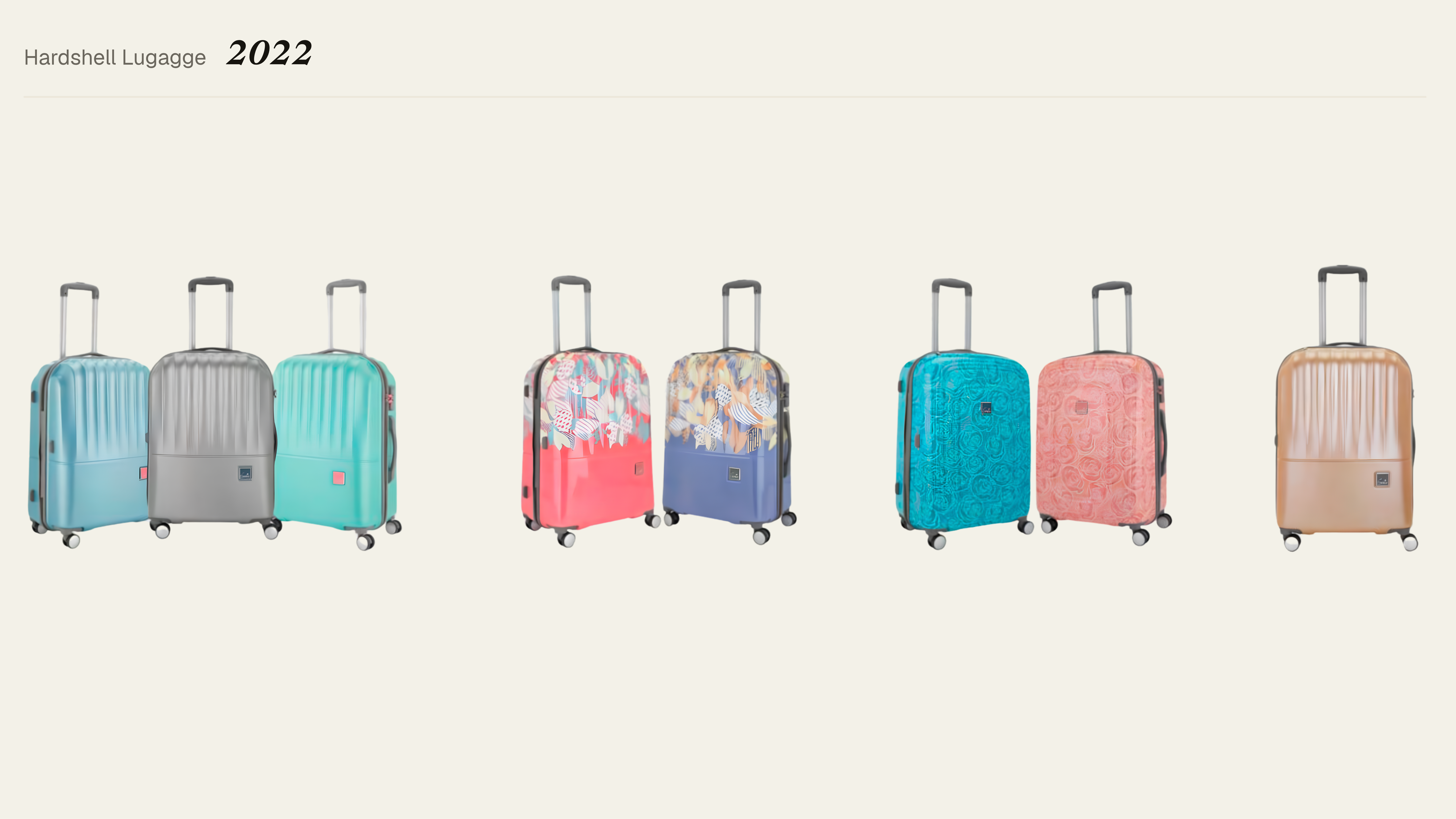
01PalmValue entrySolid polycarbonate with a twill texture and glossy finish; twin-side packing, fixed combination lock. The plain-shell entry into the category.
02Sprout & RoseMid-tierPrinted polycarbonate films over twin-side packing and premium grey components; Rose carried the volume on a maximum-capacity shell. The backbone of the hard range.
03GlamTop of hardGold semi-matte glitter film, TSA lock, multi-pocket interior. The aspirational ceiling that anchored the range upward.
Genie hardshell luggage, 2022 — built on heavy graphic prints
2022 — the hard range bet on prints. Heavy graphic films carried the brand across the shell.
Genie hardshell luggage, 2026 — a distributed CMF programme
2026 — recalibrated to a distributed CMF programme: ombrés, glitter films, concrete textures, brand accents on hardware. Same identity, said more quietly.
Soft luggage
01LilyEntryFull-body premium fabric, floral print, colour-matched components, expander, twin external pockets. The entry into soft.
02BahamasMidSteps up with a TSA lock and a footwear-storage interior, on the same full-body premium fabric. The volume middle of the soft ladder.
03HazelPremiumAnti-theft zipper, rose-gold detailing on colour-matched components, premium dual wheels, full-body premium fabric. Top of soft.
Genie soft luggage, 2022 — printed range across three price points
2022 — the soft range across entry, mid and premium. The soft format didn't carry into 2026.
08a

Reading the signal.

Heavy prints proved the language travelled — but the niche was small, and from there the two formats diverged. Hard luggage recalibrated: the same sensibility through ombrés and texture plays, widening the market without losing the brand. Soft went the other way — as the Indian market moved decisively to hardside, softside demand thinned, so we wound the soft ladder down rather than refresh a declining category. A managed exit, the same logic that retired Supreme on the backpack side. The read of the market told us what to do next.

Genie luggage — Sprout, a periwinkle hardside trolley with a botanical print across the upper shell
Sprout — the early printed range. The brand identity travelled, but the printed niche stayed narrower than we'd hoped.
Genie luggage — Scarlette, a blush ombré hardside trolley with a moulded wave texture
Scarlette — the print language matured. Graphic gave way to ombré and moulded texture; the same sensibility, said quietly, and the market widened.
08b

Sourced and adapted — the white-label extension.

Not every category-expansion move had to start from scratch. For Genie's push into work and professional categories — backpacks, satchels, totes — I sourced and customised designs from third-party manufacturers. I inherited their construction, platform and fabrics; my work was the colour, branding and small-feature adaptations that made each piece read as Genie.

This was a deliberate commercial decision, not a shortcut. Developing a new construction from scratch costs months of factory time the calendar didn't have. Sourcing and adapting let us bring newness to the work and professional range in weeks rather than seasons — cost-effective expansion without diluting the original-design programme running on the school and college sides.

It also clarified what's worth designing from scratch and what isn't. The school and college backpack ranges — where the brand identity lives and the cohort relationship is strongest — justified original construction development. The work and professional pieces, where customer expectation is "brand-appropriate variation of a familiar category" rather than "category-defining design," didn't.

Genie white-label range 2026 — sourced and adapted
The 2026 white-label range. Honest scope: construction, platform and fabric inherited from third-party manufacturers; colour, branding and small-feature adaptations by me. Original design credit not claimed.
09.Designing for scale

Holding a brand at scale.

Designing collections was only part of the role. The larger challenge was holding a growing brand together — across forecasting, development, sampling, production and launch — while making hundreds of decisions that would only be proven months later, on a shelf.

Designing forty-four bags a year is one job. Building the operating model that ships them consistently, on calendar and at scale, is another. Over five years, I gradually moved from doing the first to doing both.

09a

The calendar inside the calendar.

A Genie back-to-school range took roughly twelve months from brief to shelf. December, the brief arrived: design count, SKU count, target cost, timeline. The first three months were research — what worked in the recent launch, what was catching attention, how the consumer was evolving, what was happening in adjacent categories, where the brand could disrupt.

By the first week of April, the direction went to marketing and stakeholders for sign-off. From there, specs went out, sample development began, and the production cycle ran through sample reviews, value-engineering against shifting material costs, a sales-team review, quantity lock, launch meet with dealers in December & January, and delivery by February. Selling began in March. The peak window closed in July.

Inside that calendar, hundreds of decisions had to land in the right order. Miss one — wrong fabric direction, late component approval, missed value-engineering window — and the whole season slipped.

Genie annual development calendar — twelve months brief to shelf
Two overlapping cycles — brief-to-brief loop (12 months) and brief-to-end-of-selling lifecycle (20 months). The overlap is where the in-season feedback loop lives.
09b

One operational change that paid out every season.

When I joined, two-to-three rounds of sampling was the norm for reaching the visual presentation the brand needed. I redesigned the protocol over two years, and the gain compounded every season after.

01Sub-step approvalFabric dyeing and digital print signed off by me at the vendor stage — before the full bag was sampled — so colour and print fidelity were solved at the source, not discovered at assembly.
02Decoupled componentsPullers, charms, pouches and trims signed off independently of the bag, on their own timeline. Components have longer lead times than bag construction; running them in parallel removed the bottleneck.
03Precision specs & follow-upA spec accurate enough that round one converged on intent, plus an active vendor relationship that kept it converging.
~98%First-round visual accuracy
against specification
~90%Designs signed off
without a second round
3 → 1Sampling rounds
typical cycle
2 yrsTo formalise
the protocol

The remaining ten percent was mostly cost re-engineering — not aesthetic correction.

09c

One calendar wasn't the only calendar.

The annual back-to-school cycle was the spine, but it wasn't the only commitment. Mid-year briefs ran in parallel across six channels, each with its own design count, target cost, and timeline. Fast-turn briefs landed for ecommerce events: Big Billion Days, the Great Indian Festival, Prime Day. Five new backpacks and two luggages for Flipkart could come in while the next back-to-school range was already in development, both with business commitments to meet.

Holding multiple commercial calendars at once meant the operating model had to flex without breaking — the design system carried the cohesion, the development protocol held the cycle, and the priority of what shipped when was managed in real time.

Parallel calendars across six channels
Six channels, one operating model. Trade ran the back-to-school spine; the other five channels each ran their own calendars and fed the same architecture.
The point of an operating model isn't elegance. It's consistency at scale.

What working looked like.

Genie began as a kids-only, florals-led, trade-only school-bag label. Five years on, it was a teen-and-college brand spanning backpacks, luggage and handbags.

~6×Brand growth
2021—2026
3 → 9Ranges in a
BTS season
21 → 84SKUs per
BTS range
1 → 6Sales channels
operating model

Those are the headline figures. The clearest proof of the system, though, isn't the totals — it's individual products that outlived a market rebuilt every year. Three below stand for a wider pattern. None carries numbers here; what they show is what survival looked like.

10aA property, not a product — Amore.

Most prints get a season. Amore got several. It was launched in 2023 as part of the brand reframe — happiness as girl-power identity, not just florals — and the response made it clear it wasn't a single-season win. The brand re-launched it the following year as a recurring property the customer recognised and asked for by name. The print didn't sell as one design; it sold as a piece of brand vocabulary.

That's the senior outcome of the floral-to-girl-power reframe: it gave the brand a second visual language, and Amore proved that language could carry weight — not for one season, but as a property the brand could return to.

Amore — multi-season property
Amore — a property held across seasons rather than replaced each year. Continuity designed in, not a gap in the calendar.
10bSurviving the reset — Cool.

In a market where the entire range is rebuilt every year, the harshest test of a design is whether it survives into the next collection at all. Cool survived three. It appears in successive Genie trade range presentations and the 2023 retail catalogue, and remained on Flipkart through subsequent seasons.

One field-sales account from a market visit illustrated the mechanism — a girl walked into a dealer's shop with a screenshot of the bag from Genie's Instagram and asked for it by sight, then walked from shop to shop trying to find it. The dealer reorder followed.

A design that survives one annual reset is good fortune. A design that survives three is the audit speaking through product.

Cool — the graphic backpack that survived three annual range resets
Cool — survived three annual resets. Spotted on Instagram, asked for by sight at the dealer, reordered. A design that outlives the calendar is the audit speaking through product.
10cSass.

Sass was launched in the same 2023 collection as Amore, into the 19″ Max segment — the high-volume backpacks at the top of the range. It performed strongly in its launch season and carried into 2024, supporting the same pattern: when the audit, the architecture, and the reframe were aligned, the products that came out of them didn't just sell — they re-sold.

Sass on its own is one design that worked. Sass alongside Amore and Cool, all carrying across multiple seasons, is the system in evidence.

Sass — the high-volume backpack
Sass — launched in the 19″ Max segment, it performed strongly and carried into the next year.
10d

What the market told us.

Three designs are a sample, not a pattern. The pattern lived elsewhere — in sustained sell-through across the range, in high-bet designs reordering inside the four-month selling window, and in the in-season feedback loop that fed market signal back into in-flight development.

While the season ran, I ran pan-India market visits — listening to dealers and watching what moved, region by region. What came back went into the next range's brief, and sometimes into the current range's mid-cycle calibrations.

Knowing what sold wasn't the work. Knowing why, and building the next range on the answer, was.
01Sustained sell-throughRange-wide performance held across multiple seasons, supported by the architecture and the audit.
02Multi-season designsStrongest products — Amore, Cool, Sass among them — survived the annual reset and re-launched as recurring assets.
03In-season reordersHigh-bet designs sold out inside the selling window and were reordered for the same season.
11.Reflection

What the work was actually about.

Five years of Genie produced a backpack range, a luggage line, the brand language that held them together, and the system that shipped them on calendar. Read at the level of artefacts, that's the case study.

Read at the level of how the work was done, it was something else: a way of operating that I now recognise as five components, each one reinforcing the others. None of them are specific to backpacks. Any consumer brand operating across multiple audiences, channels and product cycles faces the same challenge — deciding what to change, what to keep, and how to know the difference.

01Reading the customerCohort research and ongoing immersion. Not asking what she wanted. Looking at what she carried, watched, copied, and decided.
02Separating signal from noiseTrend forecasting is not the work. Choosing which part of a trend is durable enough to commit factory months to — and which part will age out before it ships — is.
03Translating insight into systemsArchitecture as the answer to a fast-fashion problem. Locked palettes, platform silhouettes, fixed and disruptive fabric ratios — design as a way of building ranges, not bags.
04Holding consistency at scaleA brand language carried across formats and across years. The same identity ageing up with the customer carrying it. Not a rebrand. A continuation.
05Learning while the market is still speakingSales data, dealer feedback, regional market visits during the selling window. Building the next range on what the current range was teaching, in real time.
11a

Co-owning the dealer narrative.

Design rationale at dealer launch meets was mine; PM led commercial — pricing, SKU strategy, MRP. Together we sequenced the 16″ Supreme retirement and the Teen construction launch as a single, year-long dealer story. No surprise cuts. No orphan ranges. The retirement landed because the replacement was already promised.

11b

What would come next.

Looking back, I'd invest more heavily in formalising the feedback loop between regional market signals and range planning. The strongest insights often emerged during the selling window rather than before it. Creating a more structured way to capture and act on those signals would be the next evolution of the system.

Genie 2026 — the system in evidence
The system in evidence — five years on, the brand ageing up with the girl carrying it.
12.Role, scope & attribution

What I made, honestly.

Design and Development Manager, Safari Industries · 2021 — February 2026. Sole design owner of Genie from 2021.

Owned end-to-end
Genie's design language and its evolution across five years. Range strategy and architecture across backpacks. Original-design lines: 19″ MAX, 18″ Teen, College Korea, College range. CMF and surface direction across the brand. The sampling-protocol redesign and ongoing operational discipline.
Led with collaboration
Hardshell luggage forms — developed with another designer on construction and CAD; my work was design direction, CMF, and the brand-coherence call across the range. Range bet arguments — PMs locked final order quantities; I shaped the case for what each range bet should be. Campaign and catalogue work — PMs led the workstreams; I contributed design point of view in planning.
Commissioned & partnered on
Consumer research — Matterfox conducted the qualitative cohort study; I shaped the brief, embedded in field interviews as observer, and translated the findings into product direction. Factory and vendor relationships — Rider Bags (Bangladesh) for backpack development; Quanzhou Maxbag Company for fabric sourcing.
Leadership & succession
I led Genie's design from 2021 — the brand reframe, the cohort research, the operating model, the platform-and-component architecture, the College Korea call, the teen and college range, the luggage direction. As the portfolio grew and my move to the UK came onto the horizon, the brand needed a second pair of hands. Shital joined in early 2024 and worked under my direction on Genie: I scoped, assigned and reviewed her work against the brand. Through 2024 that review was close — the brand wasn't yet second nature to her. In parallel I designed the strategic newbuild myself: the 18″ Teen, College Korea, College Basic and 19″ MAX, drawn in 2024 to launch in 2025. By 2025 she was designing independently within the system I'd built, while I focused on simplifying the collection into a cleaner, elevated line of 17″ and 19″ platforms — retiring the 18″ as a size, not the construction. By 2026 the handover was substantially complete. She now runs Genie.
The products changed every year. The job was knowing what shouldn't.
Connect

Hiring or curious —
hello@toobaameer.co.uk

UK · FULL RIGHT TO WORK · ONSITE OR HYBRID UK-WIDE · REMOTE WORLDWIDE · DESIGN MANAGER / LEAD PRODUCT DESIGNER